Menuing is facilitated with the Dynamic Menu Add-on. It creates the HTML necessary to produce flyout menuing in many configurations. In addition, it generates the styles to produce a generic menu system.
To customize the Dynamic Menu, start by dropping the Dynamic Menu add-on on a template or content page, and render the page (display it). The system will automatically create the necessary records for the Default menu.
To create a different menu, turn on Advanced Edit, and click the Instance Options tool above the Dynamic Menu Add-on. From here, you can select any existing menu settings record, or create a new one.
At this point you can turn on editing, and edit the menu settings record, or add sections to the menu.
In the Menu record, there are several settings that effect the type of HTML that will be produced, and a tab to create or modify the styles delivered with that HTML. There are several styles selectors required for a dynamic menu. To differentiate one menu instance from another, a style 'prefix' is used. For instance, If you choose your prefix as "topNav", each of the five class selectors necessary for the menu should start with the prefix "topNav", like topNavButton, topNavPanel, etc.
I am
using the example of a menu using the style prefix eventMenu
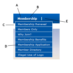
A - .eventMenuButton defines what the "button" of the menu looks like
- :hover - attributes you want when element is hovered over w/ pointer (inherits from .eventMenuButton if not defined)
- :visited - attributes you want when element has been visited (inherits from .eventMenuButton if not defined)
- .eventMenuButtonDown defines attributes when a pointer has activated the fly-out, and the pointer has moved to its sub elements (sub elements would be .eventMenuPanelButton and A.eventMenuPanelButton)
B - A.eventMenuButton defines what an anchored button on the menu looks like (A and B will almost always have identical attributes)
- :hover - attributes you want when element is hovered over w/ pointer (inherits from A.eventMenuButton if not defined)
- :visited - attributes you want when element has been visited (inherits from A.eventMenuButton if not defined)
- A.eventMenuButtonDown defines attributes when a pointer has activated the fly-out, and the pointer has moved to its sub elements (sub elements would be .eventMenuPanelButton and A.eventMenuPanelButton)
C - .eventMenuPanel defines attributes of the panel that flys out
D - .eventMenuPanelButton defines attributes of the buttons within the panel (background applied here will lay over top of the panel)
- A.eventMenuPanelButton defines what an anchored button within the panel looks like (will almost always have identical attributes as .eventMenuPanelButton)
- :hover - attributes you want when element is hovered over w/ pointer (inherits from .eventMenuPanelButton if not defined)
- :visited - attributes you want when element has been visited (inherits from .eventMenuPanelButton if not defined)
- .eventMenuPanelButtonDown (A.eventMenuPanelButtonDown) defines attributes when a pointer has activated the fly-out, and the pointer has moved to its sub elements (sub elements would be .eventMenuPanelButton and A.eventMenuPanelButton in the next tier)
E - .eventMenuDelimiter defines what the delimiter attributes are (delimiter is defined in the Dynamic Menu record example here is a |).